What is Tailwind CSS doing here?
Update February 2024:
The CSS system of this starter was invented by Andy Bell.
I wrote the following explanation quite quickly after hearing several times that people are confused about normal Tailwind CSS classes not working. In the meantime, Andy has published a better and more detailed explanation.
We are using Tailwinds “engine” to generate utility classes on demand, based on our design tokens.
If you have a look at the tailwind.config.js, you can see how that is done. For example, we are deactivating Tailwinds default reset.
We are hooking into the components layer, to make Tailwind output classes based on our tokens, instead of their default design system.
That is, you are able to use mt-xs-s instead of a class like mt-20 for example. Same goes for colors, depending on the namesin your colors.json, you get custom classes like text-pink. These use the usual Tailwind prefixes (see docs to learn how to generate colors).
You get a custom property mapped to the color name --color-my-custom-color-name and the classes bg-my-custom-color-name as well as text-my-custom-color-name.
Consider that we limit those utilities in the theme section:
backgroundColor: ({theme}) => theme('colors'),
textColor: ({theme}) => theme('colors'),
margin: ({theme}) => ({ auto: 'auto', ...theme('spacing')}),
padding: ({theme}) => theme('spacing')
If you want to add the generation for border-color classes for example, you’d have to add that right there:
borderColor: ({theme}) => theme('colors')
Also. you do have something like md:text-right available because we define the screens (src/_data/designTokens/viewports.json):
screens: {
  ltsm: {max: `${viewportTokens.sm}px`},
  sm: `${viewportTokens.sm}px`,
  md: `${viewportTokens.md}px`,
  navigation: `${viewportTokens.navigation}px`
},
Additionally, you get custom properties based on the naming of your design token files:
const groups = [
  {key: 'colors', prefix: 'color'},
  {key: 'borderRadius', prefix: 'border-radius'},
  {key: 'spacing', prefix: 'space'},
  {key: 'fontSize', prefix: 'size'},
  {key: 'lineHeight', prefix: 'leading'},
  {key: 'fontFamily', prefix: 'font'},
  {key: 'fontWeight', prefix: 'font'}
];
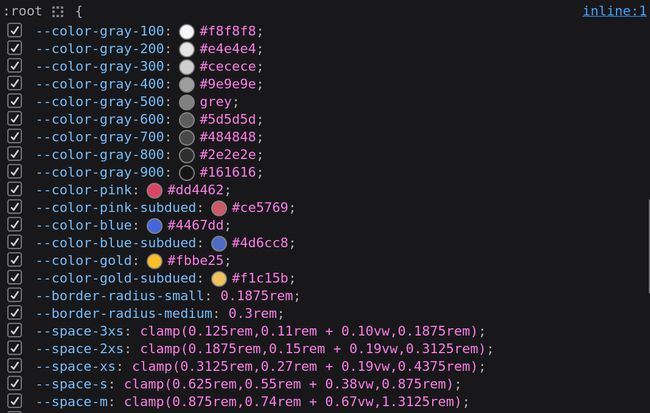
In your dev tools you can see all the generated custom properties + your custom ones from css/global/variables.css.
They are generated by default.

You can also create custom utility classes:
const customUtilities = [
  {key: 'spacing', prefix: 'flow-space', property: '--flow-space'},
  {key: 'spacing', prefix: 'region-space', property: '--region-space'},
  {key: 'spacing', prefix: 'gutter', property: '--gutter'}
];
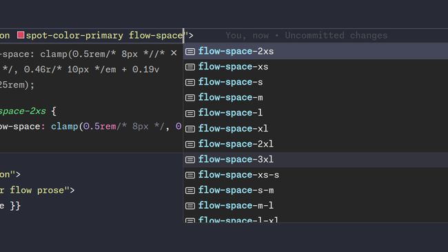
If you install the Tailwind CSS IntelliSense addon, you can actually see the classes available to you, including the color preview.

Read some thoughts that lead Andy Bell to come up with that approach: https://andy-bell.co.uk/i-used-tailwind-for-the-u-in-cube-css-and-i-liked-it/